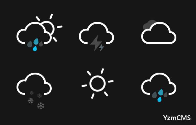
摘要:今日看到一网站天气图标做的不错,审查源码发现,竟然是css写的,实在是厉害,然后我整理了一下,在这里分享给大家...
今日看到一网站天气图标做的不错,审查源码发现,竟然是css写的,实在是厉害,然后我整理了一下,在这里分享给大家...
先看效果:
源码:
<!DOCTYPE html>
<html>
<head>
	<title>纯CSS实现带动画的天气图标</title>
	<style type="text/css">


body {
  max-width: 42em;
  padding: 2em;
  margin: 0 auto;
  color: #161616;
  font-family: 'Roboto', sans-serif;
  text-align: center;
  background-color: currentColor;
}


.icon {
  position: relative;
  display: inline-block;
  width: 12em;
  height: 10em;
  font-size: 1em; /* control icon size here */
}

.cloud {
  position: absolute;
  z-index: 1;
  top: 50%;
  left: 50%;
  width: 3.6875em;
  height: 3.6875em;
  margin: -1.84375em;
  background: currentColor;
  border-radius: 50%;
  box-shadow:
    -2.1875em 0.6875em 0 -0.6875em,
    2.0625em 0.9375em 0 -0.9375em,
    0 0 0 0.375em #fff,
    -2.1875em 0.6875em 0 -0.3125em #fff,
    2.0625em 0.9375em 0 -0.5625em #fff;
}
.cloud:after {
  content: '';
  position: absolute;
  bottom: 0;
  left: -0.5em;
  display: block;
  width: 4.5625em;
  height: 1em;
  background: currentColor;
  box-shadow: 0 0.4375em 0 -0.0625em #fff;
}
.cloud:nth-child(2) {
  z-index: 0;
  background: #fff;
  box-shadow:
    -2.1875em 0.6875em 0 -0.6875em #fff,
    2.0625em 0.9375em 0 -0.9375em #fff,
    0 0 0 0.375em #fff,
    -2.1875em 0.6875em 0 -0.3125em #fff,
    2.0625em 0.9375em 0 -0.5625em #fff;
  opacity: 0.3;
  transform: scale(0.5) translate(6em, -3em);
  animation: cloud 4s linear infinite;
}
.cloud:nth-child(2):after { background: #fff; }

.sun {
  position: absolute;
  top: 50%;
  left: 50%;
  width: 2.5em;
  height: 2.5em;
  margin: -1.25em;
  background: currentColor;
  border-radius: 50%;
  box-shadow: 0 0 0 0.375em #fff;
  animation: spin 12s infinite linear;
}
.rays {
  position: absolute;
  top: -2em;
  left: 50%;
  display: block;
  width: 0.375em;
  height: 1.125em;
  margin-left: -0.1875em;
  background: #fff;
  border-radius: 0.25em;
  box-shadow: 0 5.375em #fff;
}
.rays:before,
.rays:after {
  content: '';
  position: absolute;
  top: 0em;
  left: 0em;
  display: block;
  width: 0.375em;
  height: 1.125em;
  transform: rotate(60deg);
  transform-origin: 50% 3.25em;
  background: #fff;
  border-radius: 0.25em;
  box-shadow: 0 5.375em #fff;
}
.rays:before {
  transform: rotate(120deg);
}
.cloud + .sun {
  margin: -2em 1em;
}

.rain,
.lightning,
.snow {
  position: absolute;
  z-index: 2;
  top: 50%;
  left: 50%;
  width: 3.75em;
  height: 3.75em;
  margin: 0.375em 0 0 -2em;
  background: currentColor;
}

.rain:after {
  content: '';
  position: absolute;
  z-index: 2;
  top: 50%;
  left: 50%;
  width: 1.125em;
  height: 1.125em;
  margin: -1em 0 0 -0.25em;
  background: #0cf;
  border-radius: 100% 0 60% 50% / 60% 0 100% 50%;
  box-shadow:
    0.625em 0.875em 0 -0.125em rgba(255,255,255,0.2),
    -0.875em 1.125em 0 -0.125em rgba(255,255,255,0.2),
    -1.375em -0.125em 0 rgba(255,255,255,0.2);
  transform: rotate(-28deg);
  animation: rain 3s linear infinite;
}

.bolt {
  position: absolute;
  top: 50%;
  left: 50%;
  margin: -0.25em 0 0 -0.125em;
  color: #fff;
  opacity: 0.3;
  animation: lightning 2s linear infinite;
}
.bolt:nth-child(2) {
  width: 0.5em;
  height: 0.25em;
  margin: -1.75em 0 0 -1.875em;
  transform: translate(2.5em, 2.25em);
  opacity: 0.2;
  animation: lightning 1.5s linear infinite;
}
.bolt:before,
.bolt:after {
  content: '';
  position: absolute;
  z-index: 2;
  top: 50%;
  left: 50%;
  margin: -1.625em 0 0 -1.0125em;
  border-top: 1.25em solid transparent;
  border-right: 0.75em solid;
  border-bottom: 0.75em solid;
  border-left: 0.5em solid transparent;
  transform: skewX(-10deg);
}
.bolt:after {
  margin: -0.25em 0 0 -0.25em;
  border-top: 0.75em solid;
  border-right: 0.5em solid transparent;
  border-bottom: 1.25em solid transparent;
  border-left: 0.75em solid;
  transform: skewX(-10deg);
}
.bolt:nth-child(2):before {
  margin: -0.75em 0 0 -0.5em;
  border-top: 0.625em solid transparent;
  border-right: 0.375em solid;
  border-bottom: 0.375em solid;
  border-left: 0.25em solid transparent;
}
.bolt:nth-child(2):after {
  margin: -0.125em 0 0 -0.125em;
  border-top: 0.375em solid;
  border-right: 0.25em solid transparent;
  border-bottom: 0.625em solid transparent;
  border-left: 0.375em solid;
}

.flake:before,
.flake:after {
  content: '\2744';
  position: absolute;
  top: 50%;
  left: 50%;
  margin: -1.025em 0 0 -1.0125em;
  color: #fff;
  list-height: 1em;
  opacity: 0.2;
  animation: spin 8s linear infinite reverse;
}
.flake:after {
  margin: 0.125em 0 0 -1em;
  font-size: 1.5em;
  opacity: 0.4;
  animation: spin 14s linear infinite;
}
.flake:nth-child(2):before {
  margin: -0.5em 0 0 0.25em;
  font-size: 1.25em;
  opacity: 0.2;
  animation: spin 10s linear infinite;
}
.flake:nth-child(2):after {
  margin: 0.375em 0 0 0.125em;
  font-size: 2em;
  opacity: 0.4;
  animation: spin 16s linear infinite reverse;
}


/* Animations */

@keyframes spin {
  100% { transform: rotate(360deg); }
}

@keyframes cloud {
  0% { opacity: 0; }
  50% { opacity: 0.3; }
  100% {
    opacity: 0;
    transform: scale(0.5) translate(-200%, -3em);
  }
}

@keyframes rain {
  0% {
    background: #0cf;
    box-shadow:
      0.625em 0.875em 0 -0.125em rgba(255,255,255,0.2),
      -0.875em 1.125em 0 -0.125em rgba(255,255,255,0.2),
      -1.375em -0.125em 0 #0cf;
  }
  25% {
    box-shadow:
      0.625em 0.875em 0 -0.125em rgba(255,255,255,0.2),
      -0.875em 1.125em 0 -0.125em #0cf,
      -1.375em -0.125em 0 rgba(255,255,255,0.2);
  }
  50% {
    background: rgba(255,255,255,0.3);
    box-shadow:
      0.625em 0.875em 0 -0.125em #0cf,
      -0.875em 1.125em 0 -0.125em rgba(255,255,255,0.2),
      -1.375em -0.125em 0 rgba(255,255,255,0.2);
  }
  100% {
    box-shadow:
      0.625em 0.875em 0 -0.125em rgba(255,255,255,0.2),
      -0.875em 1.125em 0 -0.125em rgba(255,255,255,0.2),
      -1.375em -0.125em 0 #0cf;
  }
}

@keyframes lightning {
  45% {
    color: #fff;
    background: #fff;
    opacity: 0.2;
  }
  50% {
    color: #0cf;
    background: #0cf;
    opacity: 1;
  }
  55% {
    color: #fff;
    background: #fff;
    opacity: 0.2;
  }
}
	</style>

</head>
<body>
<div class="icon sun-shower">
<div class="cloud"></div>
<div class="sun">
	<div class="rays"></div>
</div>
<div class="rain"></div>
</div>
<div class="icon thunder-storm">
  <div class="cloud"></div>
  <div class="lightning">
    <div class="bolt"></div>
    <div class="bolt"></div>
  </div>
</div>

<div class="icon cloudy">
  <div class="cloud"></div>
  <div class="cloud"></div>
</div>

<div class="icon flurries">
  <div class="cloud"></div>
  <div class="snow">
    <div class="flake"></div>
    <div class="flake"></div>
  </div>
</div>

<div class="icon sunny">
  <div class="sun">
    <div class="rays"></div>
  </div>
</div>

<div class="icon rainy">
  <div class="cloud"></div>
  <div class="rain"></div>
</div>
</body>
</html>


网友评论:
真好
2017-01-21 14:18:36 回复
网友评论:
YzmCMS官方博客_袁志蒙博客网友 回复 YzmCMS官方博客_袁志蒙博客网友 :666
2016-12-30 15:26:40 回复
网友评论:
666
2016-12-30 15:26:21 回复
网友评论:
666
2016-12-09 18:09:53 回复
网友评论:
666
2016-12-09 18:09:40 回复
网友评论:
厉害
2016-11-12 22:39:04 回复